Client: Personal Project
Project: Active Ticket Price and Error Screen Redesign
Role: Designer
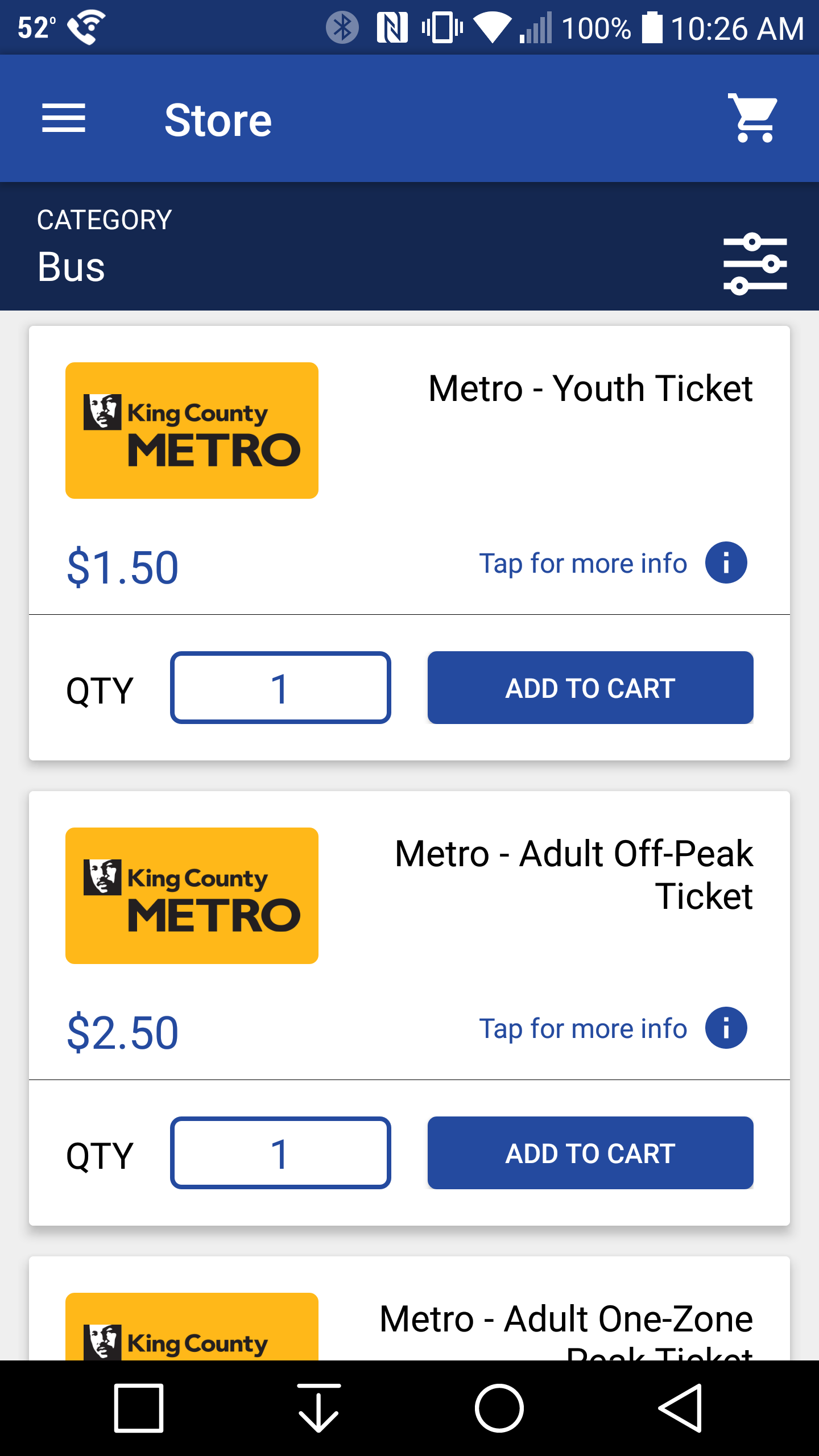
PROJECT UPDATE: While I never sent this redesign over to Bytemark for review, makers of Transit Go, they did recently update the app to include a signifier to inform the user they can tap on the ticket for more info. I added a screenshot and info at the bottom of the page.
Back Story
I had only taken public transportation a couple times before the experience that led to this UX portfolio piece. My routine was to look up the bus route on Google Maps to get the time I needed to leave for the bus, the bus number and the ticket price. I would then use Transit Go to purchase the ticket.
I was vaguely aware of peak and off-peak prices, but since Google Maps always told me the price was $2.50 I assumed that was the price I needed to pay at that given time. I did not yet realize that Google Maps will ALWAYS tell the customer the ticket price is $2.50 regardless of what time it is or how many zones they are traveling.
So I bought my ticket and walked over to the bus stop. I walk up to the bus, whip out my phone with confidence, open Transit Go app and bring up my ticket to activate it. Only this time I was greeted with the following error message:
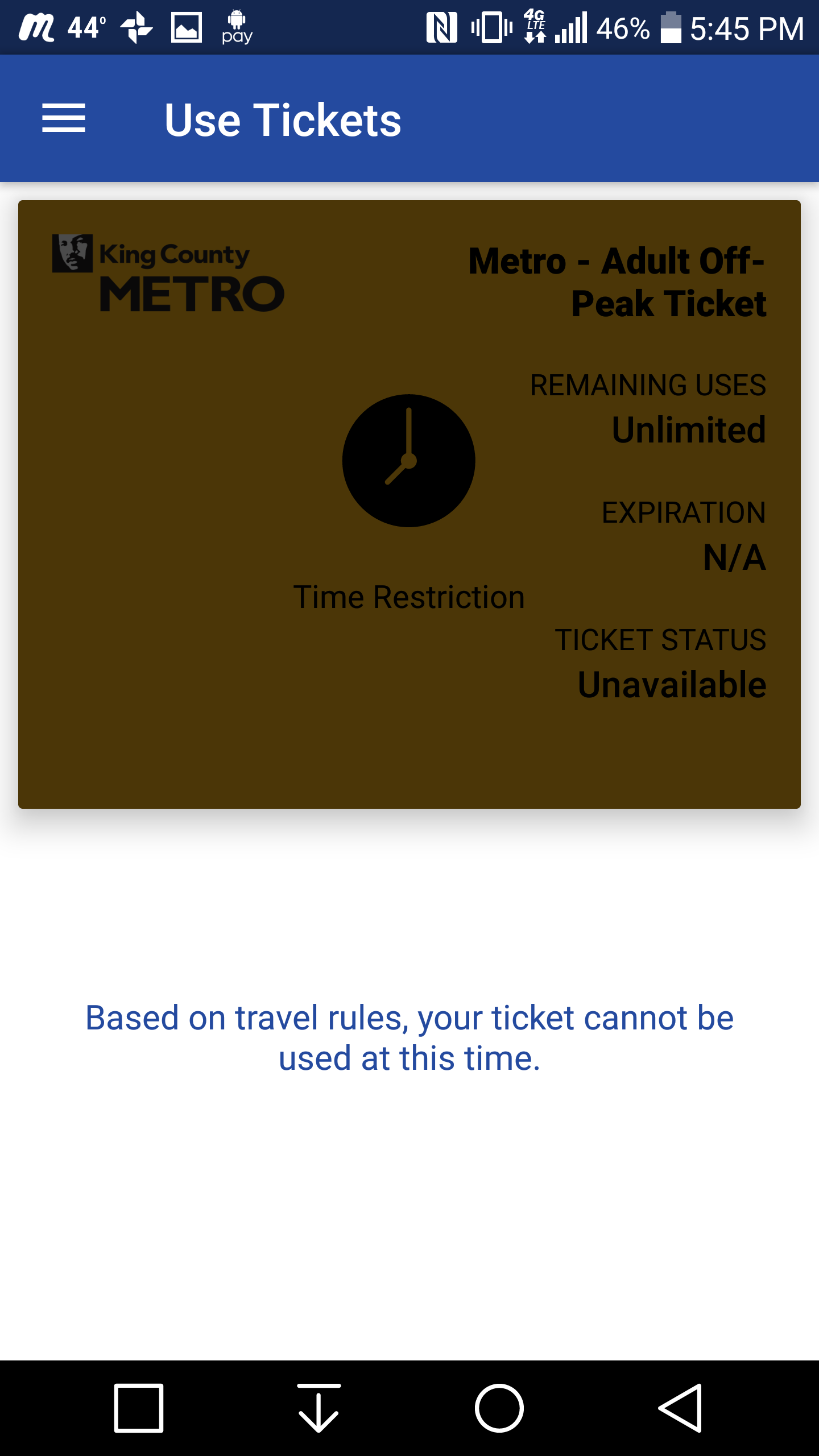
The above vague message is all the customer sees when trying to use an off-peak ticket during peak times. As a first time user experience it fails pretty hard. I showed this error to the bus driver and they didn't even know what it meant.
The driver and I resolved the ticket issue and I took my seat. My next task was to call WSDoT to get an answer. After 5 transfers I finally found out that I was trying to use an off-peak ticket during peak times. After thanking the rep and hanging up my next thought was to figure out how to improve this bad user experience and make my first UX portfolio piece!
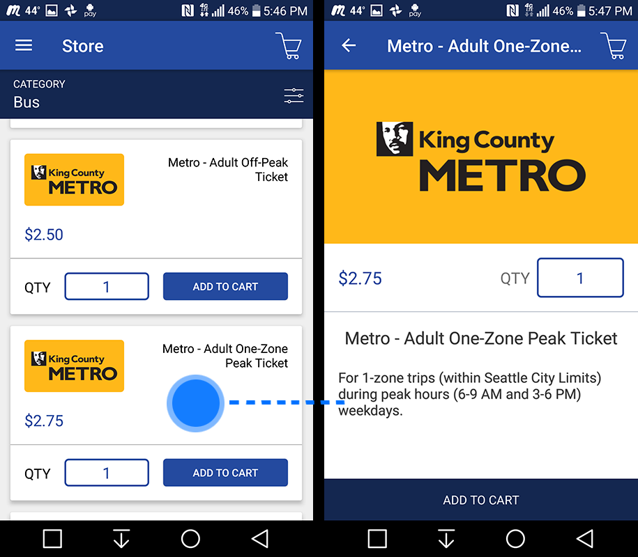
Default ticket screens
The image on the left is the default Ticket Purchase screen and one of the screens I will attempt to improve. The image on the right is the info screen the customer can access if they tap on a ticket in the image on the left. Note there are no obvious signifiers letting you know you can touch a ticket for more info.
ENVISION PHASE
Figure out what the problems were and attempt to update the Transit Go app to resolve these problems.
Problems
Problem 01: App does not inform the user upfront when a ticket they are about to purchase is the ticket that is currently active.
Problem 02: To find the active times and days for a ticket the customer must actively tap a ticket, the problem though is there are not obvious signifiers informing the user of this action.
Problem 03: The screen that informs that user they are using the inncorect ticket isn't explicit in it's message.
Desired Solutions
Solution 1: Customer is informed of the time and day(s) a ticket is active before they purchase it / while they are browsing options.
Solution 2: The error window presented to the customer when a ticket can't be used properly informs the customer of why the ticket can't be used.
Restrictions
Don't completely redesign the app. Continue utilizing what works and only redesign the screens that address the problems.
research phase
Since this was a quick exercise resulting in a minor change, but with a possible great impact, for the existing Transit Go app I didn't spend as much time in the research phase. Using the app and seeing it's different parts gave me a clear idea of what I wanted to do. Knowing that presenting relevant information to the customer is critical was a driving force in the redesign.
IDEATE / PROTOTYPE PHASE: lo-fi mockups
Given the nature of this exercise, that it would reuse the existing layout of the Transit Go app I chose to combine the Ideate and Prototype phases.
Lo-Fi Sketch v.1
With this in mind the first sketch placed the current active ticket price(s) at the top of the list with call out signifiers on either side to draw the customers attention. This made it obvious. A down side is it would change the general order of the ticket prices depending on the time of day. This raised the question about what the repercussions might be if the app dynamically shifted the tickets round.

Lo-Fi Sketch v.2
This mockup takes the dynamic encapsulation of the active ticket further and completely surrounds the current active ticket(s) in an orange ring and adds "Active Ticket" as a header to make it clear what the customer is looking at. The other tickets are placed below.
My dilemma with the tickets rearranging is it might confuse some customers should their intention be to purchase a ticket for later use that is not currently active.

IDEATE / Prototype Phase: Hi-Fi Mockups
Hi-Fi Wireframe v.01
This wireframe places the current active ticket(s) at the top of the app and outlines them with a border along with descriptive text at the top informing the customer that what they are looking at is the current active ticket.
I moved the day/time information for tickets onto the ticket its self so all information is present upfront with no need for further action.

Hi-Fi Wireframe v.02
This mock up does away with dynamically moving and encapsulating the current active ticket and instead uses a signifier and iconography to inform the customer which ticket(s) are currently active.

Hi-Fi Wireframe v.03
To offer an even simpler version. This third Hi-Fi mockup removes all of the visual and dynamic additions and simply keeps the informative text on each ticket that informs the customer when that ticket is active. The user needs to glance up at the time on their phone to verify.

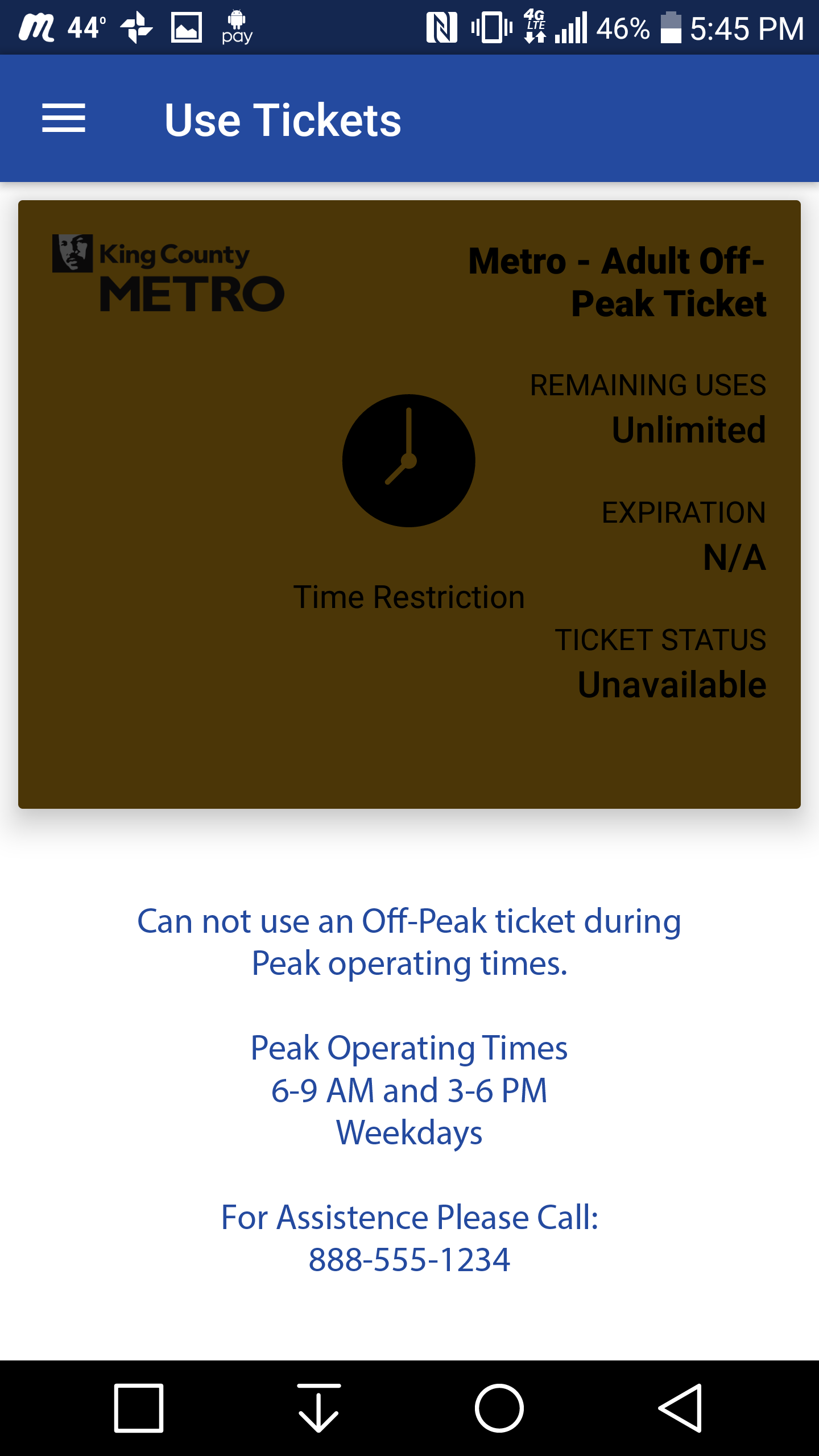
Hi-Fi Wireframe - "Can't Use Ticket" Screen
This is a mockup of the error window you see when trying to use a ticket during an invalid time. I've updated the text to directly tell the customer why they can't use their ticket. Now even if you are using the app for the first time, as I was, you'll understand the problem and be presented with an option to get help should you need it.
PROTOTYPE PHASE: Working Prototype
This working prototype takes you up to the purchase screen. The end however simply shows the updated Error screen which in turn takes you back to the start of the app.
Project Update
While I never sent my redesign over to Bytemark for review, below is a screenshot from a recent Transit Go update that shows Bytemark is aware of and trying to address the issue of customers finding more information about tickets. They added the "Tap for more info !" signifier to each ticket.